A marathon medal should show the race identity at a glance and still be practical to produce. Start with the race name, distance, year, and one main visual. Then decide what belongs on the back and ribbon. An AI tool can help you explore a concept, but the image still needs to be converted into production artwork. In this article, I will show you what to check before you approve the medal design. If you only have a logo or reference images, send them to us and we can help organize the design.
1. Decide What the Medal Needs to Communicate
Before we draw anything, we confirm the race name, distance, year, location, award wording, and any sponsor logo that must appear. These details often arrive in different files or messages. Putting them into one list helps us avoid missing a date, using an old logo, or placing the wrong distance on the artwork.
Next, separate the required information from the optional information. The race name and distance normally need to be easy to see. A long slogan or a group of sponsor logos can move to the back or ribbon. This gives the main design more room.
2. Build the Design Around One Main Race Story
The strongest marathon medal designs usually have one clear subject. It could be a city landmark, a section of the race route, a mountain, or the event logo. When everything is treated as the main subject, the medal becomes crowded and none of the details stands out.
Use a Local Landmark or City Symbol
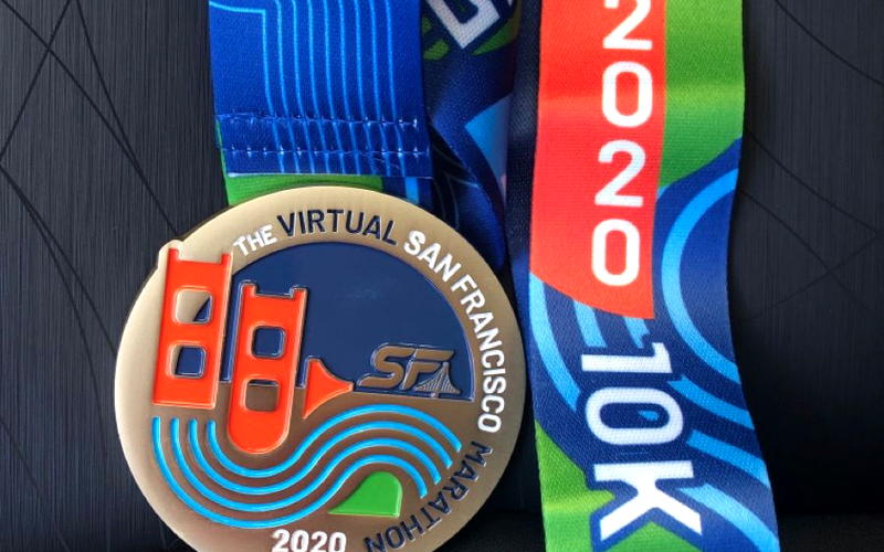
For a city marathon, choose one feature that runners can recognize quickly. A bridge, tower, historic building, or skyline can work well. You do not need to reproduce every window and street. Simplifying the landmark normally makes it clearer on the finished medal.
Use the Race Route or Terrain
A trail race may use a mountain profile, elevation line, forest, or river. A road race can use the course outline when the route itself is meaningful. If the original route has too many small turns, simplify the line instead of copying it exactly.
Use the Event Logo or Mascot
If the race already has a recognizable logo, it can become the center of the medal or even define its outer shape. A mascot works well for family runs, school events, and races with a more playful identity.
We often receive several reference images in one inquiry. The organizer likes the shape from one medal, the colors from another, and the 3D effect from a third. These references are useful, but they still need one common direction. We first decide what the medal should say about the race, then select the ideas that support it.
| Race Direction | Main Visual | Practical Treatment |
|---|---|---|
| City marathon | Landmark or skyline | Clear 2D text with a 3D landmark |
| Trail race | Mountain or elevation line | Relief with an antique finish |
| Night run | Event logo or route | Glow enamel as an accent |
| Multiple distances | Shared main layout | Change the distance or color |
3. Arrange the Front and Back of the Medal
Keep the Main Event Identity on the Front
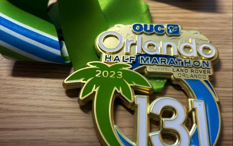
The front is normally the side people see first in finish line photos and medal displays. Use it for the race name, distance, year, and main graphic. Make the distance large enough to read without looking closely.
Move Supporting Information to the Back
The back can hold a short event message, location, additional race information, or sponsor recognition. Moving these details away from the front does not make them less important. It simply gives each piece of information a better place.
We once worked on an order for 350 pieces of 3.5-inch finisher medals. During artwork approval, the customer decided to remove the word "FINISHER" and changed the ribbon from black with red text to red with black text. The medal had not entered production, so we could update both parts before the mold was made. This is exactly why the front, back, and ribbon should be reviewed together.
4. Match the Medal Size and Shape to the Artwork
Do not choose the smallest medal first and then try to squeeze the whole design into it. A simple logo with a race name needs much less room than a design containing a landmark, date, distance, sponsor logos, and small text.
A larger medal gives the artwork more room, but it also increases the weight and cost. The right size is the one that keeps the important details clear without making the medal unnecessarily large. We will cover the specific size choices separately in the Marathon Medal Size Guide.
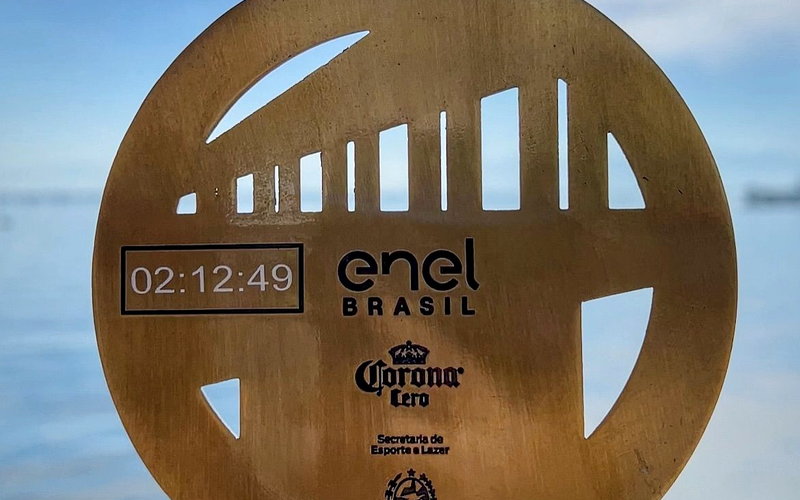
Round medals are easy to arrange and suit many traditional races. Custom shapes can follow a race logo, landmark, state outline, or mountain profile. The outside shape still needs to be strong enough for production. Very narrow extensions and too many small internal cutouts may not form properly in the finished medal.
For complex outlines, cutouts, and deep 3D designs, we normally recommend zinc alloy because it gives us more freedom with the shape. A regular flat design without internal cutouts may also be made with die struck iron. At Perfect Crafts Gifts, we review the artwork before recommending the material.
5. Use Color, Relief, and Special Features With a Purpose
Choose Between 2D and 3D Details
A 2D design works well for logos, lettering, flat color areas, and clean graphic shapes. A 3D relief is better for faces, buildings, animals, terrain, and other subjects that need natural depth.
The whole medal does not have to use the same treatment. We can keep the race name and distance in clear 2D areas while using 3D relief for the main landmark. This keeps the information readable and still gives the medal depth.
Match the Plating and Colors to the Race Theme
The plating color is confirmed as part of the artwork, before we make the mold. It should match the event colors and the way the raised and recessed areas are arranged. It is not something we wait to choose after production has started.
Bright plating suits clean and simple artwork, but it shows fingerprints and light surface marks more easily. Antique finishes usually give raised and recessed details more contrast.
For a painted medal, we normally keep the smallest color area at about 2 mm or more. If a design contains gradients, shadows, photographs, or details that are too small to separate with metal lines, printing is usually the better solution.
Add Special Features Only When They Support the Idea
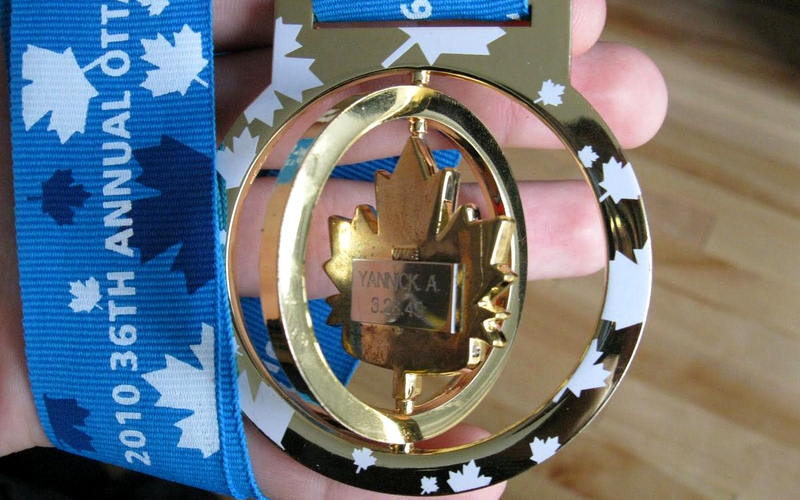
A cutout can follow the arch of a bridge. A spinner can reveal a second graphic. Glow-in-the-dark enamel can suit a night run. Glitter may work with a festive or charity event. Choose a feature because it fits the race, not because it happens to be available. If you need professional advice, we can share examples of medals we have made before to help you compare the options.
6. Design the Ribbon Together With the Medal
The ribbon is part of the medal design. Its background color, logo, text, and print direction should follow the same visual style as the medal. It can also carry sponsor logos or repeated event information when there is not enough space on the metal body.
Simple logos and text can use screen printing or heat transfer printing. Heat transfer printing is also suitable for full-color artwork, gradients, and repeating backgrounds. Always check both sides of the ribbon artwork because the direction can change after the ribbon is folded and assembled.
There are two common ways to connect the ribbon. A straight ribbon can be sewn into a V shape and attached to the medal with a small split ring. A medal with a top slot allows the ribbon to pass directly through the slot. When we prepare the artwork, we adjust the slot to match the ribbon and confirm both widths together.
For one 90 mm trail running medal project, the customer sent us the medal design and asked us to improve the ribbon. We prepared the medal and ribbon artwork together after the antique gold direction was confirmed. This avoided treating the ribbon as a separate item at the end of the project.
7. Review the Medal at Its Actual Production Size
A design can look clear when it fills a computer screen and become difficult to read when reduced to the real medal size. Print the artwork at a 1:1 scale. A 1:1 print is a useful first check for text size and layout. It cannot confirm whether thin metal lines, small enamel areas, or deep relief will produce clearly. We still review these details on the production proof.
Check the race name, distance, year, date, location, spelling, colors, sponsor logos, and front-to-back direction. Check the ribbon as well. A correct medal with an upside-down ribbon logo is still a production error.
Vector files such as AI, EPS, CDR, or a vector PDF are the easiest for us to work with. Convert fonts to outlines so the lettering does not change when the file is opened on another computer. A high-resolution JPG can be used as a reference, but it may need to be redrawn before production.
An AI-generated image can be used as a concept reference. It is not production artwork. We still need to rebuild the design and confirm the size, relief, metal lines, colors, and ribbon on the proof.
Once you approve the production artwork, we use it to make the mold. Any change after the mold has been made may require a new mold and an additional charge. Take time to check the proof carefully. It is much easier to correct a date on the screen than on hundreds of finished medals.
8. Conclusion
A good marathon medal design starts with the race information. Decide what the medal must communicate, choose one main visual, and give the supporting details a suitable place on the back or ribbon. The size, shape, color, relief, and ribbon should all follow the same design direction.
If you have a finished design, we can check whether it is suitable for production. If you only have a logo, sketch, or group of reference images, Perfect Crafts Gifts can help you organize them into a production artwork for approval.
9. Frequently Asked Questions
Can the Same Medal Design Be Used for Different Race Distances?
Yes. Keep the same main design and change the distance, color, or small identifying detail, but approve separate artwork for every version.
Can We Leave Space for Finisher Names or Times?
Yes. We can reserve a flat area on the back for later laser engraving. Confirm the engraving area and who will complete the personalization before production.
Can Sponsor Logos Be Printed on the Ribbon Instead of the Medal?
Yes. Printing sponsor logos on the ribbon is a practical solution when the medal face does not have enough clear space.
Should a Race Series Use Connecting or Puzzle Medals?
Use connecting or puzzle medals only for a planned race series, and design every piece together from the beginning so the finished set fits correctly.
Can I Use an AI-Generated Medal Image for Production?
It can be used as a concept reference, but not as production artwork. We still need to rebuild the design and confirm the production details on the proof.
Do I Need a Finished Design Before Requesting a Quote?
No. Send the race name, distance, year, logo, quantity, required delivery date, and any reference images. We can recommend a practical direction before preparing the proof.